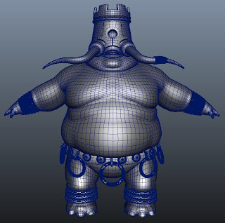
Remember this guy? I'm done with the basemesh and ready to send it over to zBrush for sculpting. I still have to UV him, but that's not a very exciting step to blog about...
The model is much denser than I would usually make it, but our teacher insisted that we put most of the detail in the basemesh to avoid having to retopologize the model after sculpting. I also felt that I had more control over the shape despite there being more manual work. I want to try a different workflow some other time where I instead start from a really rough basemesh, do all the detailing in zBrush and then retopologize the model when I'm done. I think this could be a lot faster and looser, but it kinda depends on me finding a good retopo workflow which I've heard zBrush lacks.
Enough about that though. Here is my guy:
Monday, October 25, 2010
Sunday, October 24, 2010
Colour and Design - Midterm Portrait
Time for something non-3D. In addition to Organic Modeling I'm also taking a color theory class names Colour and Design. Because Everybody at my school always complains over how hard it is and the work load, and while it's true that it's a lot of work I'm having a lot of fun with it and I feel like I learn something new every class. I haven't worked a lot with colour outside of some 3D texturing so this is a much needed subject for me
So far we haven't done a lot of work outside of theoretical stuff like value chats and colour wheels, but for our midterm we had to pick a photo and make a posterized image of it that we then were to colour with a complimentary colour scheme. I chose a red-red-orange to blue-blue-green scheme, but because of the way that colours become desaturated when mixed with whites, blacks and complimentaries the final result is rather subtle. The image I chose was from the french movie The City of Lost Children. It's a beautiful movie where pretty much every frame can be framed and put on the wall. The man is a part of a cult of blind people that serve a mad scientist in exchange for bionic eyes that allow them to see again.
All in all I'm very pleased with it, especailly considering I had to work on this while I was sick and was a nyQuil fueled zombie most of the time. I need to darken one of the midtone steps because it jumps too much when it goes from the gray to brown, and there are a few tiny spots I forgot to paint. But once I have made those corrections I plan on submitting it to the school's Spring Show.
So far we haven't done a lot of work outside of theoretical stuff like value chats and colour wheels, but for our midterm we had to pick a photo and make a posterized image of it that we then were to colour with a complimentary colour scheme. I chose a red-red-orange to blue-blue-green scheme, but because of the way that colours become desaturated when mixed with whites, blacks and complimentaries the final result is rather subtle. The image I chose was from the french movie The City of Lost Children. It's a beautiful movie where pretty much every frame can be framed and put on the wall. The man is a part of a cult of blind people that serve a mad scientist in exchange for bionic eyes that allow them to see again.
The picture is a bit grainy and the colors are a bit off because the board and the mount of the picture is so large I had to take the picture using my camera. I did my best to clean it up in photoshop but it still leaves some to be desired. It also looks much better from a distance, like this:
All in all I'm very pleased with it, especailly considering I had to work on this while I was sick and was a nyQuil fueled zombie most of the time. I need to darken one of the midtone steps because it jumps too much when it goes from the gray to brown, and there are a few tiny spots I forgot to paint. But once I have made those corrections I plan on submitting it to the school's Spring Show.
Subscribe to:
Posts (Atom)


