Sindre Opsahl Skaare
3D Art and the occasional doodle.
Tuesday, December 31, 2013
Rockin' some Rocks
Just a rockwall done for practice one sunday afternoon. Trying out some new techniques, as well as Marmoset Toolbag 2.
Happy new years!
Labels:
3D,
3DCoat,
Environment,
Organic Modeling,
Rendering,
Texturing,
zBrush
Thursday, February 14, 2013
A simple asset, but a lot of technical hurdles...
I decided to practice some sci-fi and found this neat concept by Jeremy Love.
Very simple asset, but when I brought it into UDK it ended up looking like this:
Ugh, awful.
My problem is that my normal map is mirrored, which means that half of the UV shells are flipped which cause problems with how the normals are calculated in the engine.
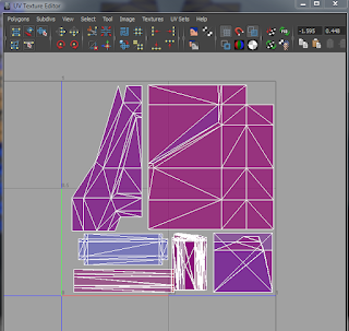
Look at all that red. That's a bad sign all right. So after some research I came up with this solution.
First of all you need to fix your UV's. UDK hates mirrored UV's so I flipped the red shells so they are blue and nicely correspond to their geometry again. The problem of course is that they no longer line up with the texture any more, but there's a solution to it.
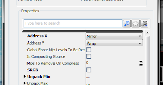
In UDK you can change the way that textures tile in the Texture Properties. The default is Wrap which is the mode we're all used to, but there's also Mirror and Clamp. Mirror is the one we're interested in because it does this:
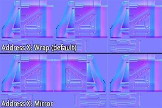
Excellent! This means that if we lay out or UV’s this way they will match the mirroring:
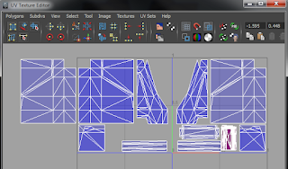
But it’s not that simple, because when you mirror the normal map horizontally you end up flipping the X axis (red channel) which causes mirrored lighting. But with a little bit of material editor magic we can fix that.
We can flip the red channel by multiplying the normal map with a float3 with the values -1,1,1, but we want that to only apply to the mirrored UV’s. This is also fairly simple. All we have to do is to lerp the two normal maps with a checker pattern with its UV tiling set to 0.5. This will make it match up to the alternating mirroring and mask out the x-flipped normals from where we don’t need them. But again it’s not that simple, because when you mirror the normal map horizontally you end up flipping the X axis (red channel) which causes mirrored lighting. But with a little bit of material editor magic we can fix that. We can flip the red channel by multiplying the normal map with a float3 with the values -1,1,1, but we want that to only apply to the mirrored UV’s. This is also fairly simple. All we have to do is to lerp the two normal maps with a checker pattern with its UV tiling set to 0.5. This will make it match up to the alternating mirroring and mask out the x-flipped normals from where we don’t need them.
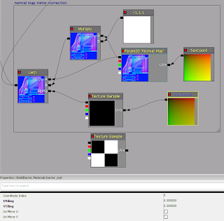
And the results?
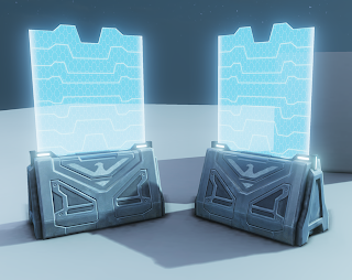
Perfectly mirrored normals! No seams, huzzah! :D
Hope this is helpful to y’all.
Very simple asset, but when I brought it into UDK it ended up looking like this:
Ugh, awful.
My problem is that my normal map is mirrored, which means that half of the UV shells are flipped which cause problems with how the normals are calculated in the engine.

Look at all that red. That's a bad sign all right. So after some research I came up with this solution.
First of all you need to fix your UV's. UDK hates mirrored UV's so I flipped the red shells so they are blue and nicely correspond to their geometry again. The problem of course is that they no longer line up with the texture any more, but there's a solution to it.
In UDK you can change the way that textures tile in the Texture Properties. The default is Wrap which is the mode we're all used to, but there's also Mirror and Clamp. Mirror is the one we're interested in because it does this:


Excellent! This means that if we lay out or UV’s this way they will match the mirroring:

But it’s not that simple, because when you mirror the normal map horizontally you end up flipping the X axis (red channel) which causes mirrored lighting. But with a little bit of material editor magic we can fix that.
We can flip the red channel by multiplying the normal map with a float3 with the values -1,1,1, but we want that to only apply to the mirrored UV’s. This is also fairly simple. All we have to do is to lerp the two normal maps with a checker pattern with its UV tiling set to 0.5. This will make it match up to the alternating mirroring and mask out the x-flipped normals from where we don’t need them. But again it’s not that simple, because when you mirror the normal map horizontally you end up flipping the X axis (red channel) which causes mirrored lighting. But with a little bit of material editor magic we can fix that. We can flip the red channel by multiplying the normal map with a float3 with the values -1,1,1, but we want that to only apply to the mirrored UV’s. This is also fairly simple. All we have to do is to lerp the two normal maps with a checker pattern with its UV tiling set to 0.5. This will make it match up to the alternating mirroring and mask out the x-flipped normals from where we don’t need them.

And the results?

Perfectly mirrored normals! No seams, huzzah! :D
Hope this is helpful to y’all.
Labels:
3D,
Daily Sketches,
Environment,
Hard Surface,
Lowpoly,
Maya,
nDo,
Rendering,
Shaders and Materials,
Technical Art,
Texturing,
UDK
Tuesday, February 12, 2013
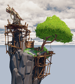
The Apex Observatory is finally finished!
Finally finished this gosh darn thang. Still lots of room for improvement and things I want to add and tweak, but it's time to move on.
The scene was designed with a point and click adventure in mind, so this is the angle it would appear in game. I laid it out in a way so that they player would always be visible. The general idea is that you take the lift up there and try to convince the hermit astronomer who lives up here to help you.
Here's the hero prop himself, the telescope. Once I got a cubemap of this environment baked down it fit in the scene much much better. There are still some stylistic clashes that I want to touch up on, like the wood, but that will be later.
Here are some simple sketches I did to work out some of the designs and layout.
Now let's talk technical art! :D
The whole scene uses five materials. One unique material for the telescope, and 4 modular materials that are instanced across the rest of the assets. I have one basic diffuse/normal/spec material, one metallic material, one window material and one foliage material.
This is the basic material, and as the name implies it's fairly basic. It has two parameters to control the specular strength and the glossiness of the asset as I find those always require a lot of tweaking. The Material Function is a simple setup to control the U and V tiling separately and I made it into a function because I found myself using it a lot over different materials.
The metal material is just the basic material with a cubemap added on top of it. Instead of just multiplying the cubemap right on top of the diffuse I use Fresnel as a mask into a Lerp node so the reflections are stronger at a glancing angle, which mimics how reflections work in real life. I also have a Reflectivity parameter that simply fades it out for a more subtle look.
The telescope material is similar to the metal material, but with some added effects for a spesific look. Looking around for tips on metal materials I found what some called a "car paint" effect, and i liked the extra boost it gave to the highlights. I'm also adding the cubemap and car paint effect to the emissive. The metal material originally had this as well, but I didn't like the look of it on the other assets.
For the foliage I had to rebuild the lighting because I was using custom vertex normals on the alpha planes. I also added a parameter to control the diffuse brighness to lighten the shadowed areas.The reason I did this is because I changed the Lightmass settings to give a much brighter and colorful look, but the foliage is dynamic and don't recieve the same indirect lighting. Some fine tuning is needed since the leaves turned out extremely bright in some shots.
It also has a simple sine wave in the WorldPositionOffset to give it the look of rustling in the wind. Vertex color is used to mask the weight of the wind for a less uniform look. I decided to go for a simple setup like this rather than deal with WindDirection actors because the scene was so small and only had a few assets it effected.
The first couple of attempts at the tree didn't turn out good at all so I took a close look at how the Airbørn team did their wonderful foliage, and I discovered that they just had a ton of alpha planes scattered on a mesh with a tiling texture. Super efficient and gives really nice looking results. Using a script I was able to mash this together in 5 minutes. The central mesh also helps deal with overdraw.
Now to round this off here are some things I learned from doing this:
And in general I learned a TON of technical stuff about UDK and game engines in general, lots of material tricks, some neat sculpting workflows, NDo2 and DDo, and how awesome the Polycount Google hangouts are for productivity and learning. Thanks guys!
The scene was designed with a point and click adventure in mind, so this is the angle it would appear in game. I laid it out in a way so that they player would always be visible. The general idea is that you take the lift up there and try to convince the hermit astronomer who lives up here to help you.
Here's the hero prop himself, the telescope. Once I got a cubemap of this environment baked down it fit in the scene much much better. There are still some stylistic clashes that I want to touch up on, like the wood, but that will be later.
Here are some simple sketches I did to work out some of the designs and layout.
Now let's talk technical art! :D
The whole scene uses five materials. One unique material for the telescope, and 4 modular materials that are instanced across the rest of the assets. I have one basic diffuse/normal/spec material, one metallic material, one window material and one foliage material.
This is the basic material, and as the name implies it's fairly basic. It has two parameters to control the specular strength and the glossiness of the asset as I find those always require a lot of tweaking. The Material Function is a simple setup to control the U and V tiling separately and I made it into a function because I found myself using it a lot over different materials.
The metal material is just the basic material with a cubemap added on top of it. Instead of just multiplying the cubemap right on top of the diffuse I use Fresnel as a mask into a Lerp node so the reflections are stronger at a glancing angle, which mimics how reflections work in real life. I also have a Reflectivity parameter that simply fades it out for a more subtle look.
The telescope material is similar to the metal material, but with some added effects for a spesific look. Looking around for tips on metal materials I found what some called a "car paint" effect, and i liked the extra boost it gave to the highlights. I'm also adding the cubemap and car paint effect to the emissive. The metal material originally had this as well, but I didn't like the look of it on the other assets.
For the foliage I had to rebuild the lighting because I was using custom vertex normals on the alpha planes. I also added a parameter to control the diffuse brighness to lighten the shadowed areas.The reason I did this is because I changed the Lightmass settings to give a much brighter and colorful look, but the foliage is dynamic and don't recieve the same indirect lighting. Some fine tuning is needed since the leaves turned out extremely bright in some shots.
It also has a simple sine wave in the WorldPositionOffset to give it the look of rustling in the wind. Vertex color is used to mask the weight of the wind for a less uniform look. I decided to go for a simple setup like this rather than deal with WindDirection actors because the scene was so small and only had a few assets it effected.
The first couple of attempts at the tree didn't turn out good at all so I took a close look at how the Airbørn team did their wonderful foliage, and I discovered that they just had a ton of alpha planes scattered on a mesh with a tiling texture. Super efficient and gives really nice looking results. Using a script I was able to mash this together in 5 minutes. The central mesh also helps deal with overdraw.
Now to round this off here are some things I learned from doing this:
- Don't overthink stuff. The simplest solution is often better and will save you a lot of time. The first iteration of this environment fell apart because I was getting too elaborate with the modularity and materials, which resulted in a slow and unsatisfying workflow.
- Have a plan. The biggest mistake I did was to jump into this without a clear piece of concept art and an asset breakdown/list. Since I winged a lot of the designs as I went along most of the stuff in this scene went through several iterations before I got a result that worked out. This was a big waste of time and I could have finished in half the time if I had spent more time planning ahead of time.
- Use lots and lots of material instances. In the beginning I kinda rushed through the process and had a unique material for every asset because I didn't really care about performance. But as soon as I cleaned up my scene and instantiated my materials it became immensely easier to do tweaks for each asset, and having them all draw from the same parent made updating and adding to them much faster.
- Use more scripts. This is something I already know and need to work on, but it bears repeating. Using scripts and shortcuts for even simple stuff speeds things up immensely. If something usually takes 3 steps and you can reduce it down to 2 you've just sped yourself up by 33%! I still prefer doing some things by hand. Automation can only take you so far, there is no good make art button.
- Take breaks. There were parts where I was so sick of this environment and strongly considered scrapping it because I felt it wasn't going anywhere good. This was usually after working a whole week straight on it with no breaks. After stepping away from it fora few days and doing something different like the Art Jam I was able to return to it with new vigor. But aside from big breaks like that taking small ones during the day are important too. I started experimenting with the pomodoro technique which means I have a timer running and every 25 minutes I'll take a quick 5 minute break and step away from the PC. I'll go outside, do the dishes, make a cup of tea. Anything that's not in front of the computer. When I return I've reset my mind and work more efficiently because it eliminates the habit of getting caught up in small details and gives you a chance to think about the problem at hand. And my room has never been tidier. :p It's probably not for everyone, but I recommend everyone give it or at least some variant of it a go.
And in general I learned a TON of technical stuff about UDK and game engines in general, lots of material tricks, some neat sculpting workflows, NDo2 and DDo, and how awesome the Polycount Google hangouts are for productivity and learning. Thanks guys!
Friday, February 8, 2013
Polycount art jam presents: Porco Rosso!
Polycount has this art jam thread going on where they rotate through themes every week. This week's theme was Studio Ghibli, so I did a bust of the dreaded flying pig Porco Rosso!
Blocked everything out in zBrush and then brought parts into 3Dcoat and Maya to tighten them up a bit. Then I did a nice soft polypaint pass and brough some screengrabs into photoshop for some color adjustment goodness. Fun times!
Blocked everything out in zBrush and then brought parts into 3Dcoat and Maya to tighten them up a bit. Then I did a nice soft polypaint pass and brough some screengrabs into photoshop for some color adjustment goodness. Fun times!
Labels:
3D,
3DCoat,
Creature,
Handpainted Textures,
Maya,
Organic Modeling,
Rendering,
Texturing,
zBrush
Monday, December 3, 2012
Apex Telescope
The Apex Observatory environment turned out to be too ambitious, and I made some bad decisions in the beginning which greatly slowed me down. So in order to complete something by the time of graduation I decided to scale things down and focus on a hero prop for the environment while I sort out the rest.
Unlike my usual workflow of modeling a highpoly and baking down maps I decided to try something different. All the detailing on the telescope was done 100% in Photoshop using the plugin nDo2. The plugin is also nice enough to generate AO and cavity, which I used as a nice base for the texture. Quixel's new plugin dDo was released just as I was done texturing my telescope, which is a shame because it would have made the process a lot faster.
In retrospect I should have been better at reusing details and features on it, particularly on the cylindrical parts as they are all rather similar. It would have saved me a ton of time. Also I should have made the mechanism at the base more nonsensical and interesting looking since the whole design is very whimsical.
Now I am doing a quick and very simple environment for it to live in. I'm going with the same basic idea as the Apex Observatory where a rickety and precarious observatory has been built on a very high and narrow peak above the clouds. Except now it's scaled down to a single eccentric astronomer living as a hermit on a tiny patch of land. Here is an early iteration:
Labels:
3D,
Apex Observatory,
Environment,
Hard Surface,
nDo,
Texturing,
UDK
Friday, November 30, 2012
dDo is pretty neat.
So dDo by Quixel is in open beta now and I gave it a spin. Just a simple test on a super generic nonsense sci fi wall, but it's a very handy tool. Won't be able to replace doing texturing b hand, but it automates a lot of the drudgery of painting in scratches along edges and blending dirt into cavities. Me likey.
Labels:
3D,
dDo,
Environment,
Hard Surface,
Maya,
nDo,
Texturing
Monday, November 5, 2012
Fatty The Pirate
I think this guy has shown up in a previous post or two, but I decided to sit down one day and texture him. I tried out a new approach to handpainted textures where I make a base diffuse lighting pass out of the green channels (up vector) of a Bent Normal map and a PrtP map, and make a cavity map out of a normal map to bring out some details. Then I just painted skintones and such and blended them with the light pass. It turned out pretty nice, I'll definitely keep using this technique.
Labels:
3D,
Handpainted Textures,
Lowpoly,
Organic Modeling,
zBrush
Subscribe to:
Comments (Atom)


